

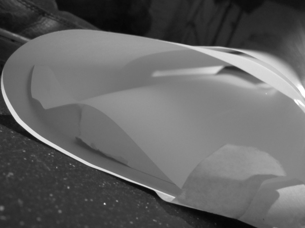
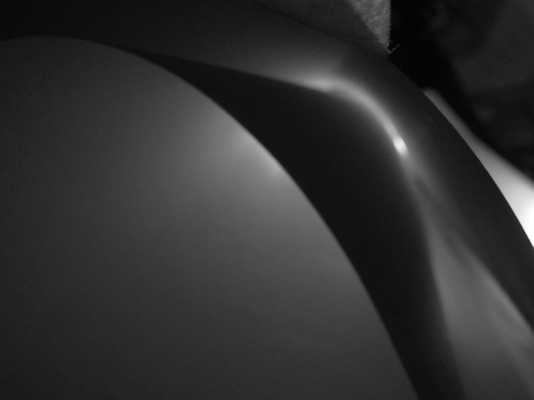
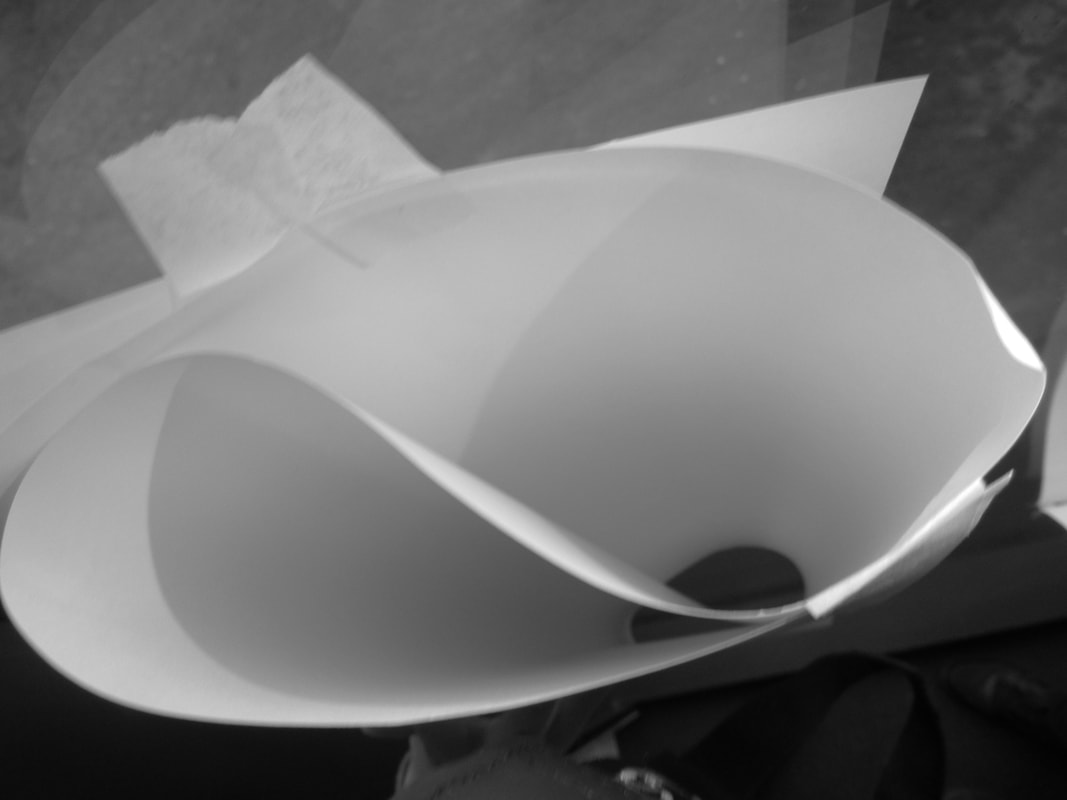
paper edges


www: we got a lot of good photos and some good angales and good exposer i like all the photos we took
homework
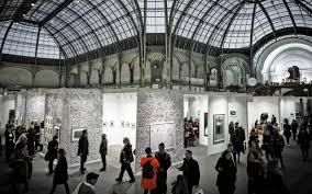
germain krull
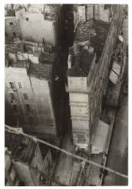
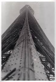
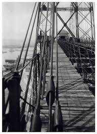

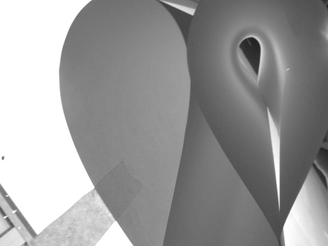
1)the formal element i pick is lines because in all of her photos they have lines in and she makes different shapes with lines and she explores her shapes with lines and she gets all different types of lines
2)the viewpoint is different in her photos it depends what she is taking a photo of.
2)the viewpoint is different in her photos it depends what she is taking a photo of.
assement
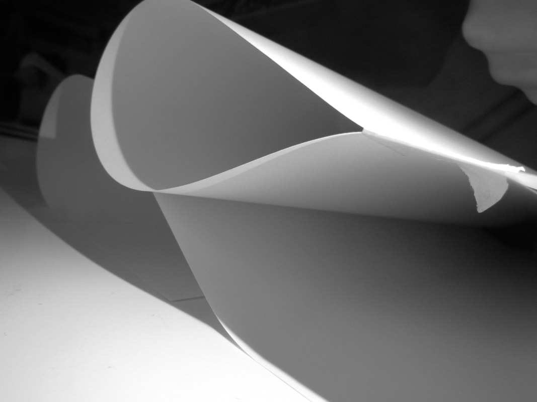
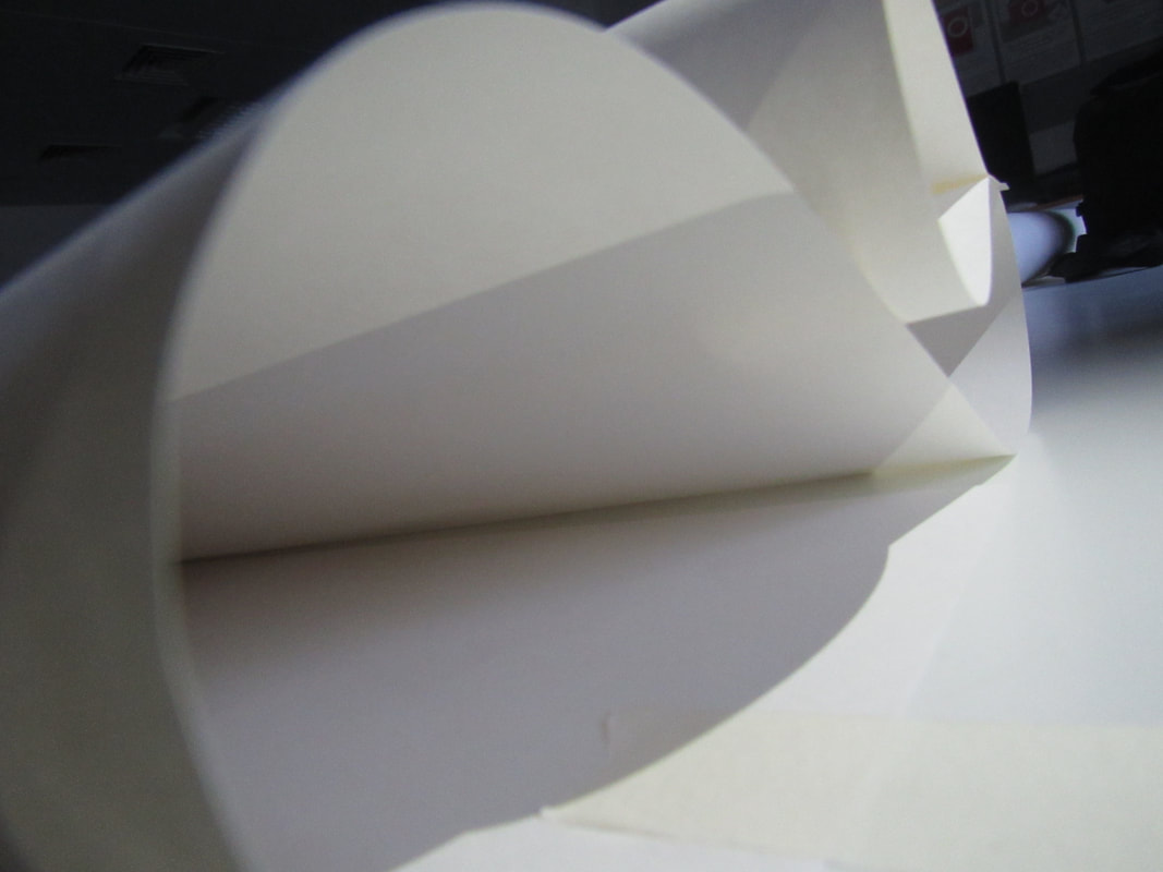
i picked these photos because they are differant and they can be worked together i thougt these where the best photos out them all
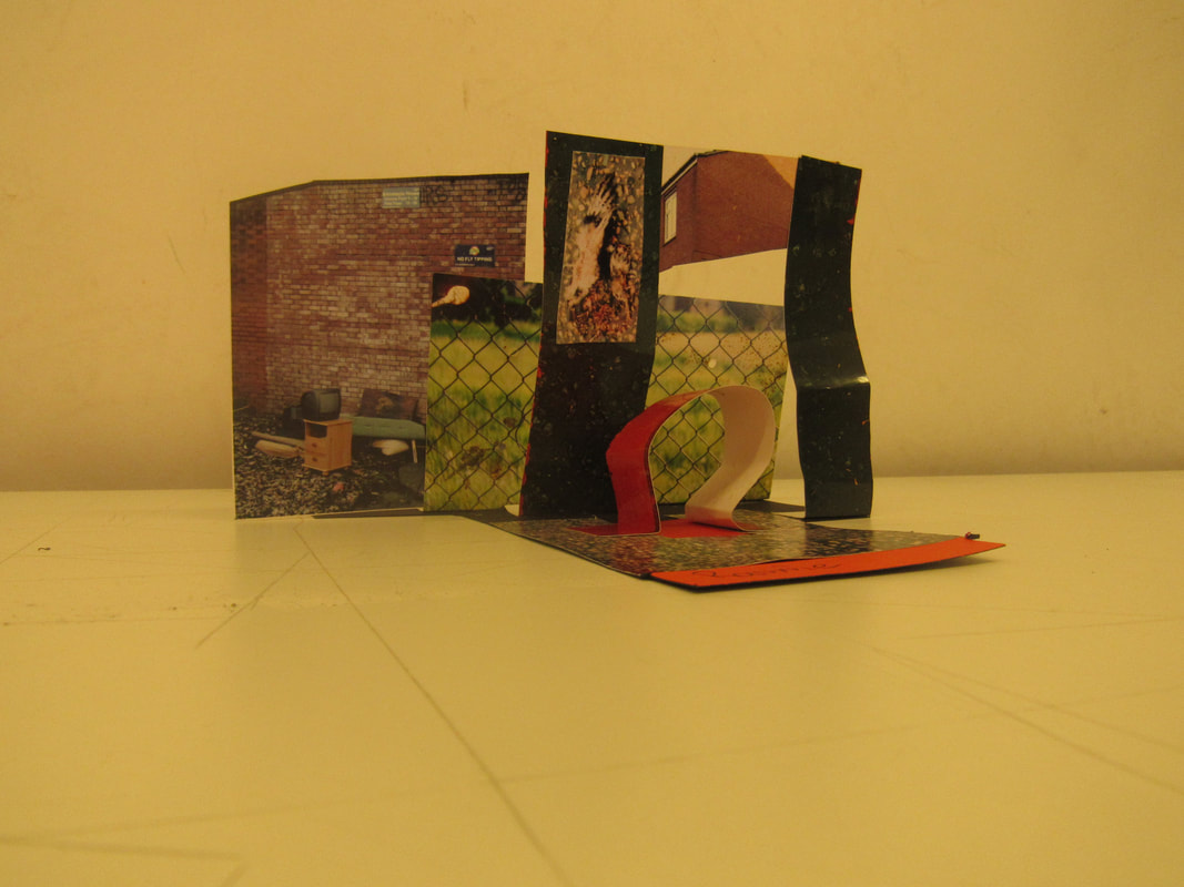
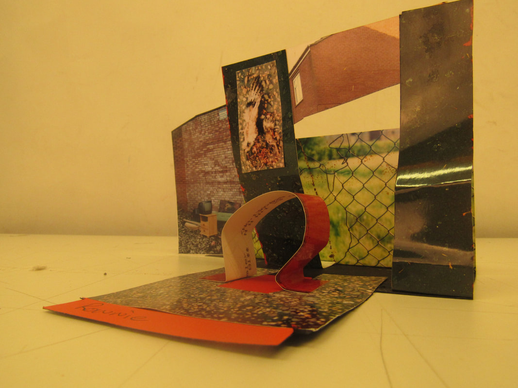
I made this model because it went togethrer and i thought it was a good set of coulors and the compersition went im really happy with my result ~
www: i like my model and i think it goes well with the photo
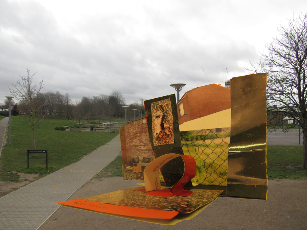
ebi: photoshop was easyer and i could move my model in a better compersition
ebi: photoshop was easyer and i could move my model in a better compersition
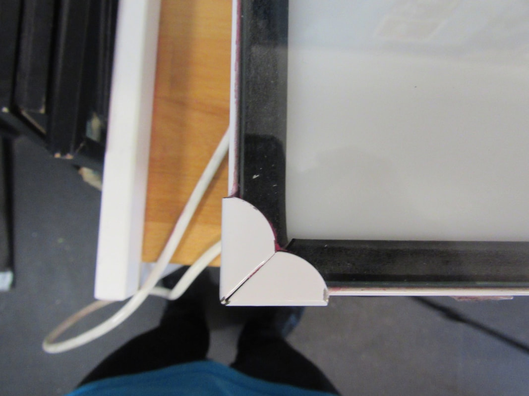
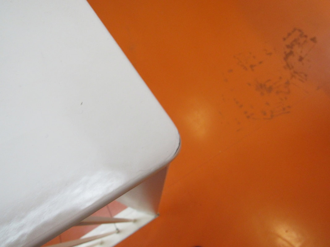
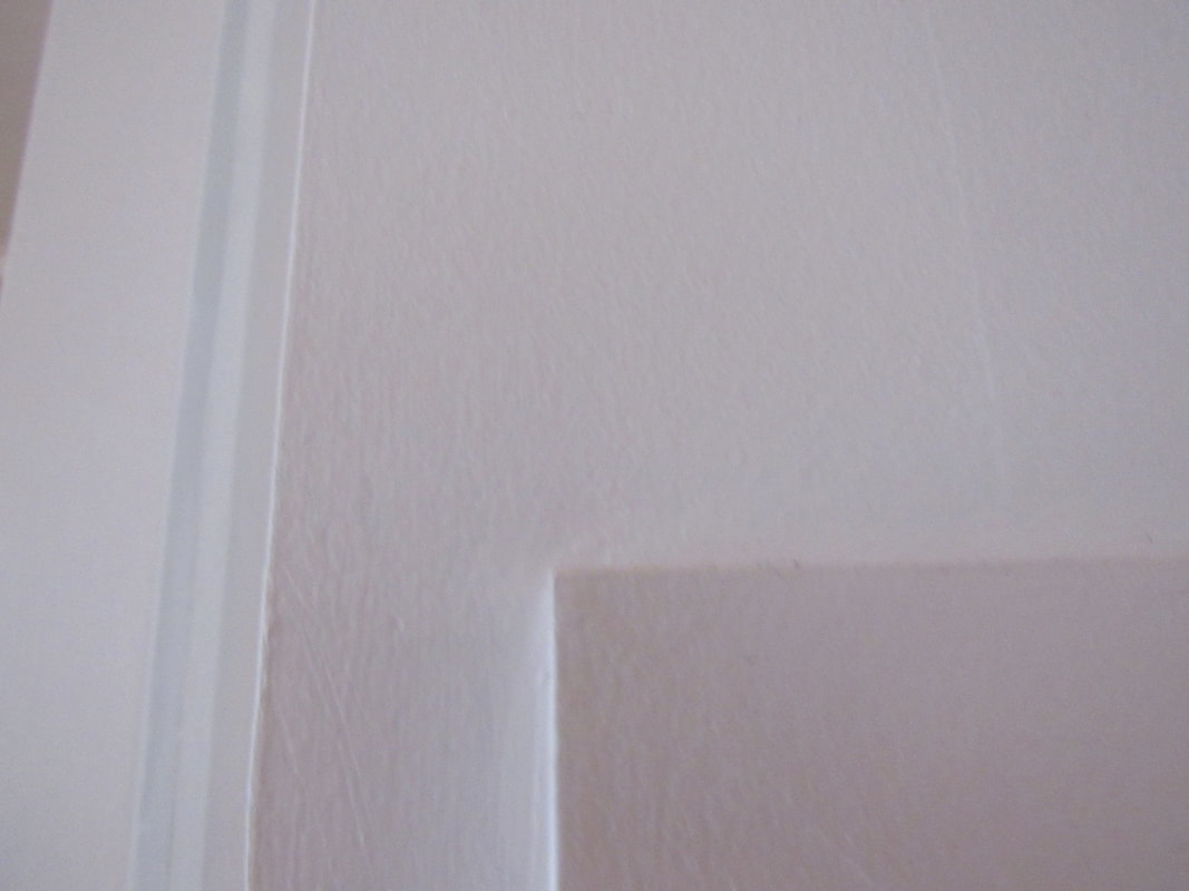
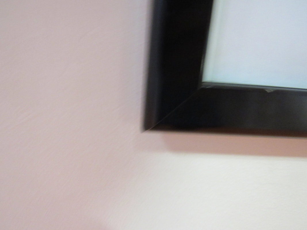
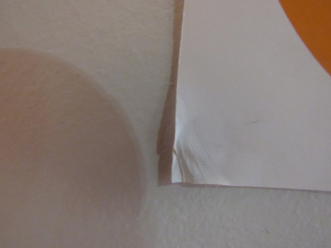
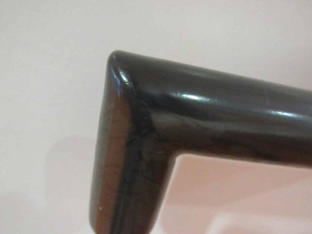
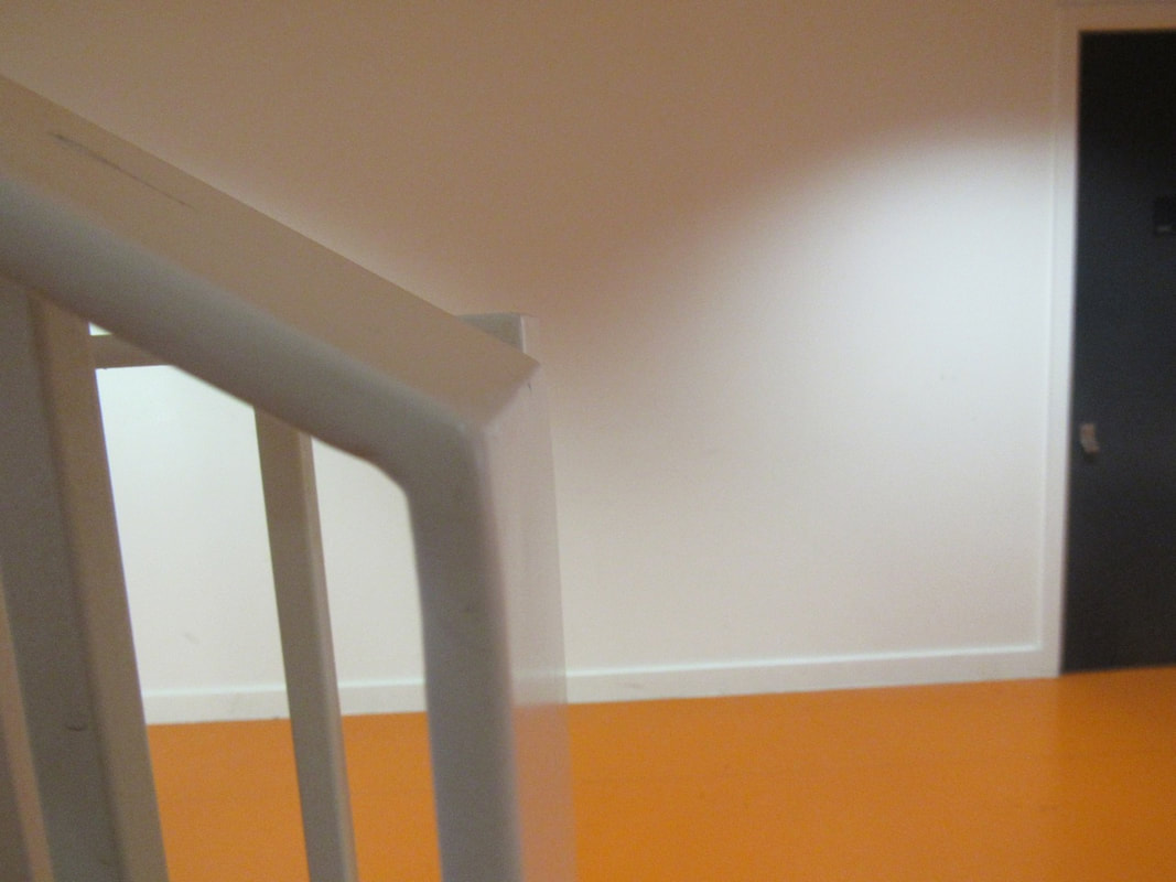
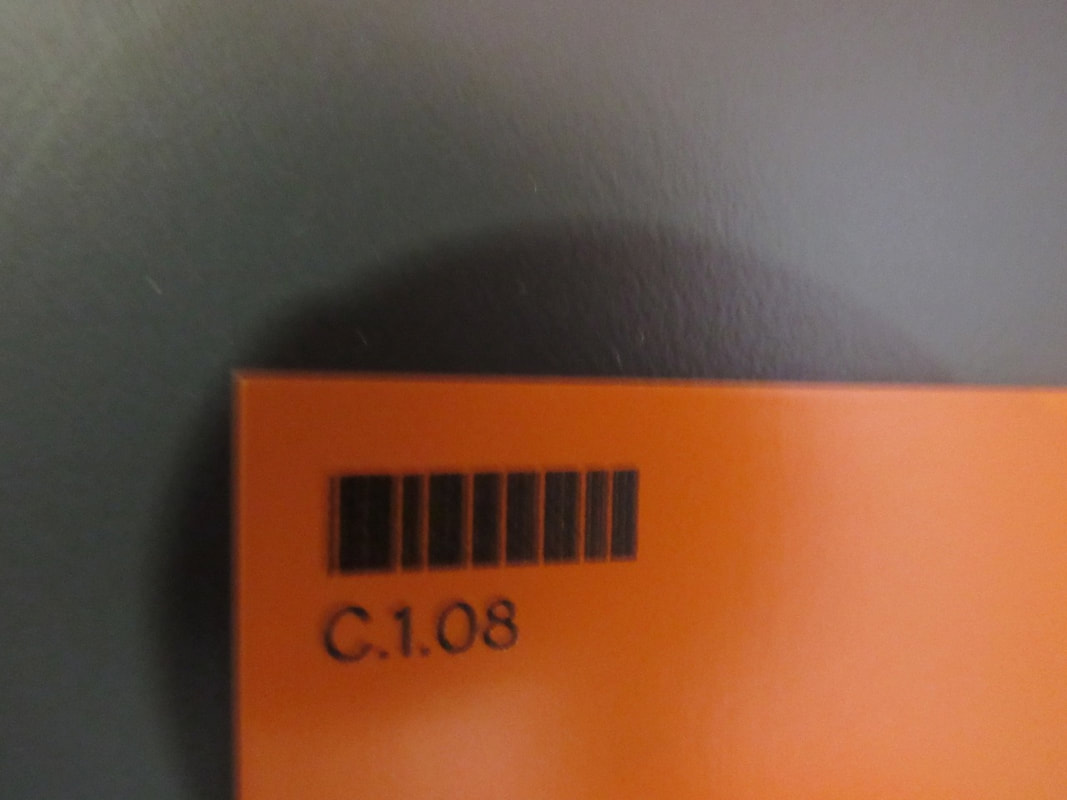
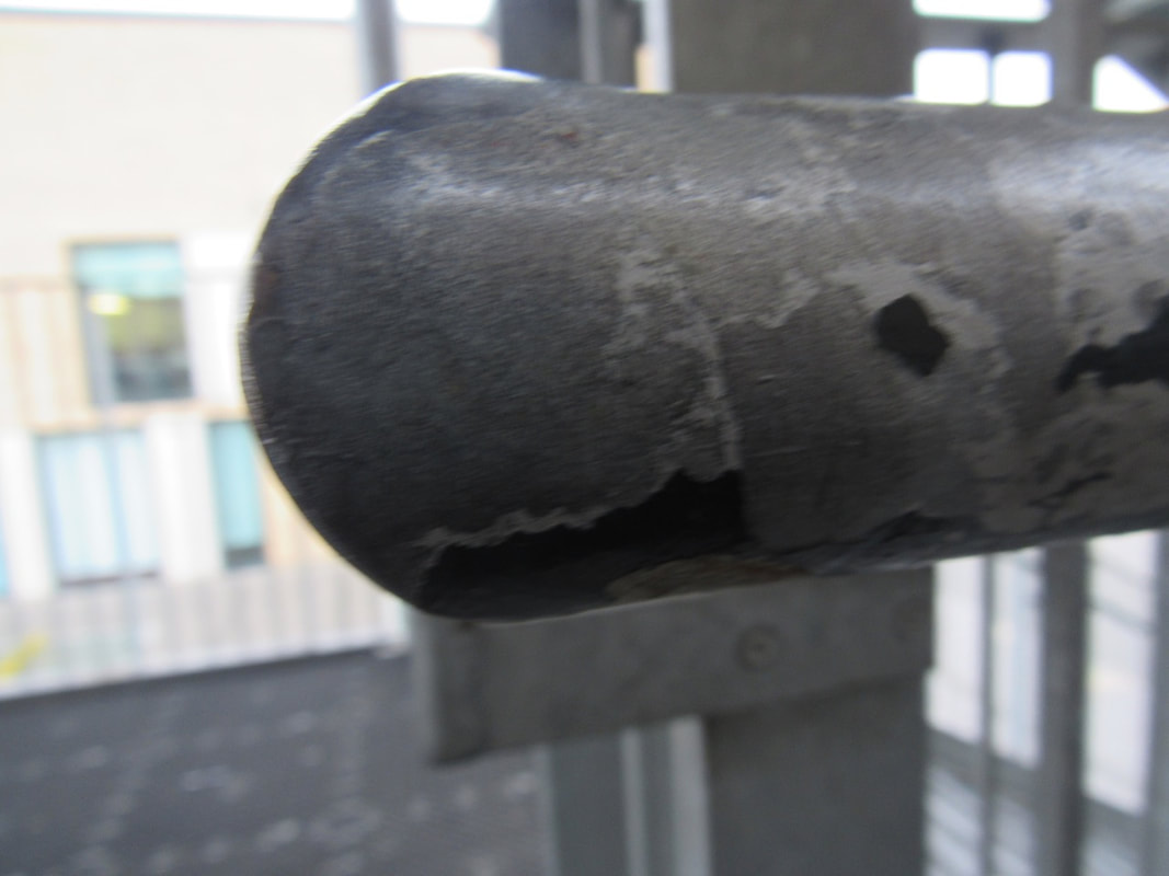
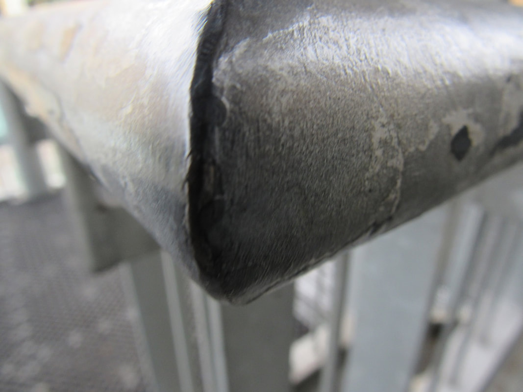
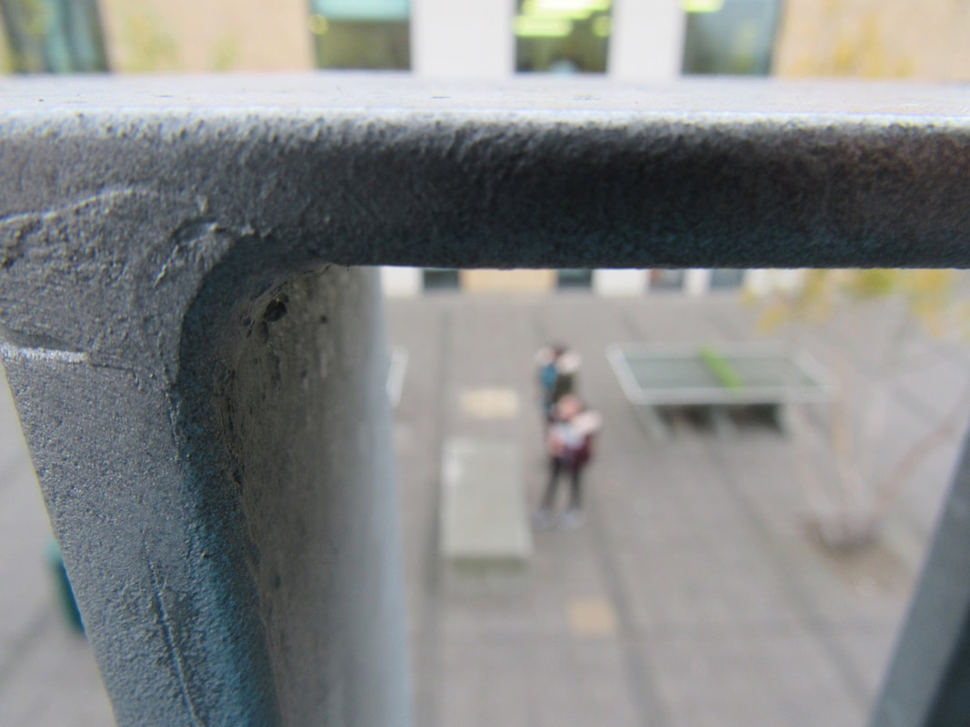
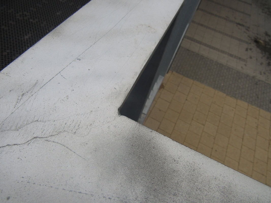
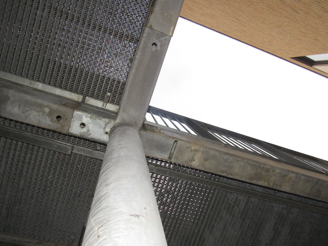
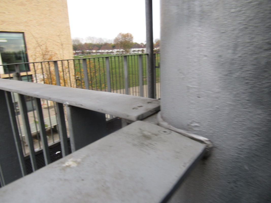
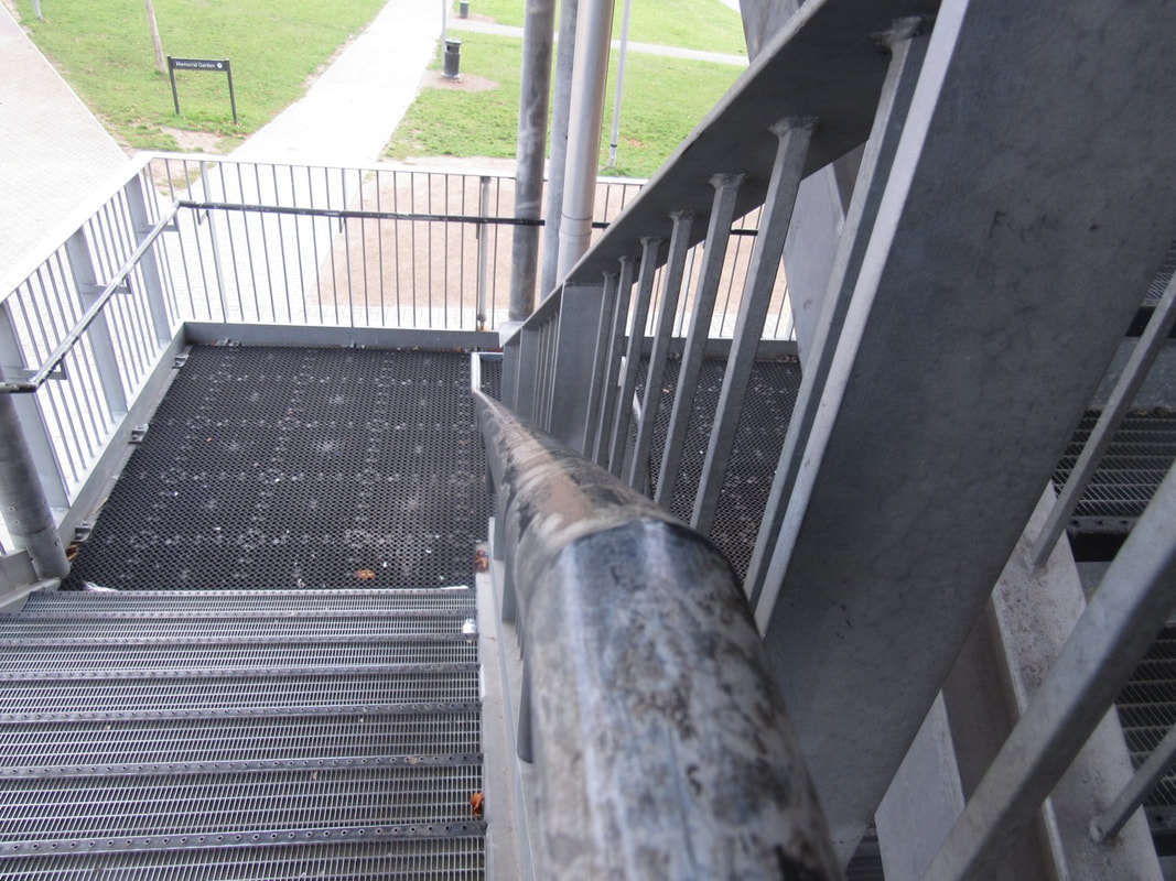
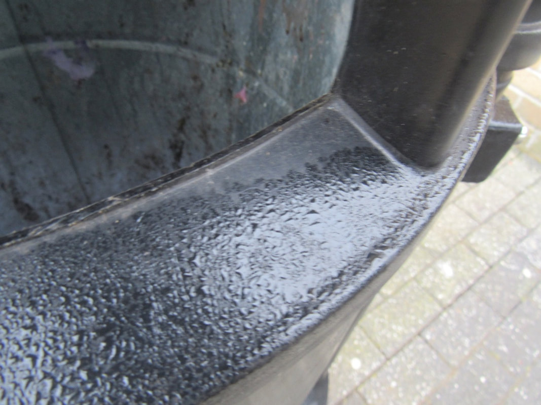
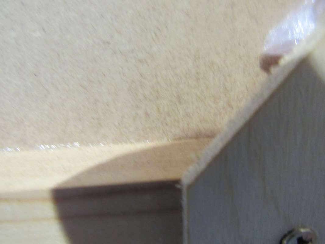
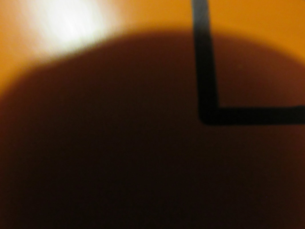
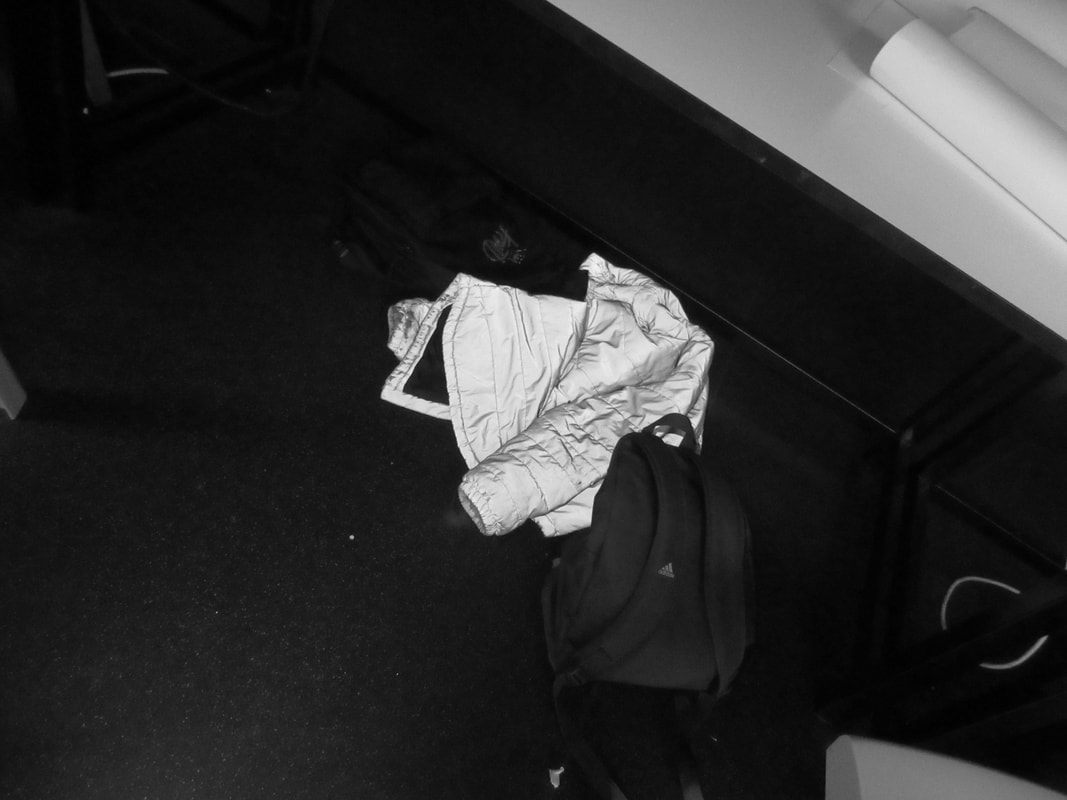
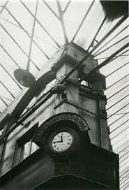
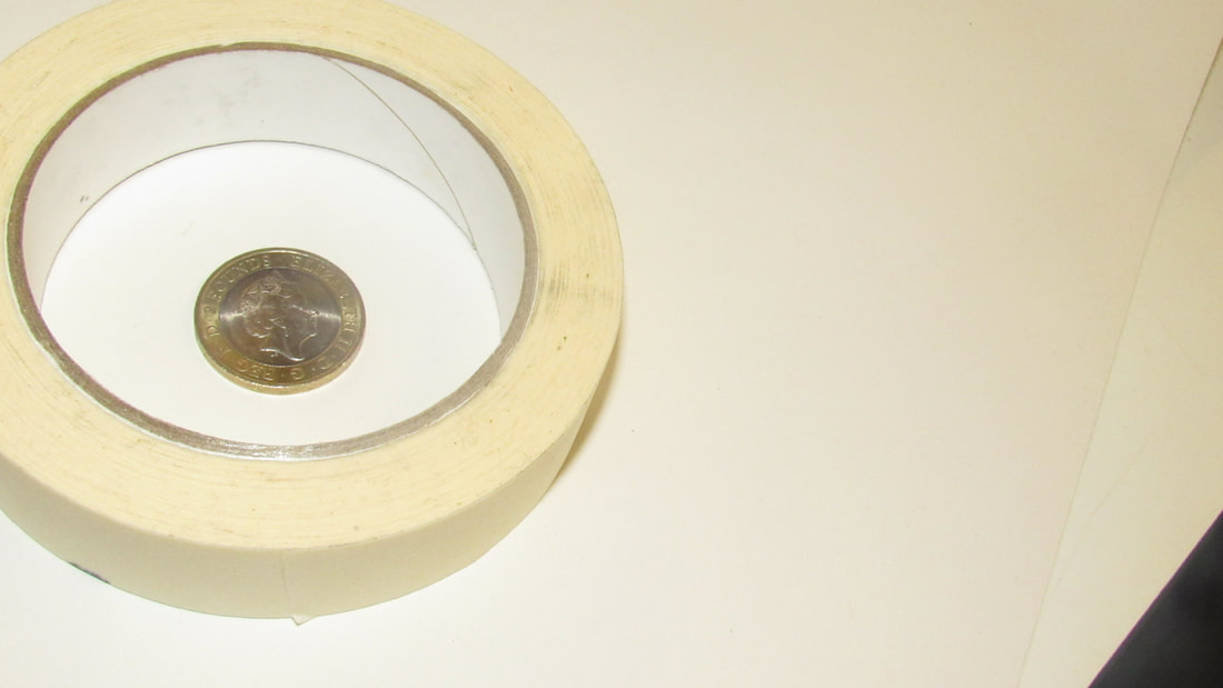
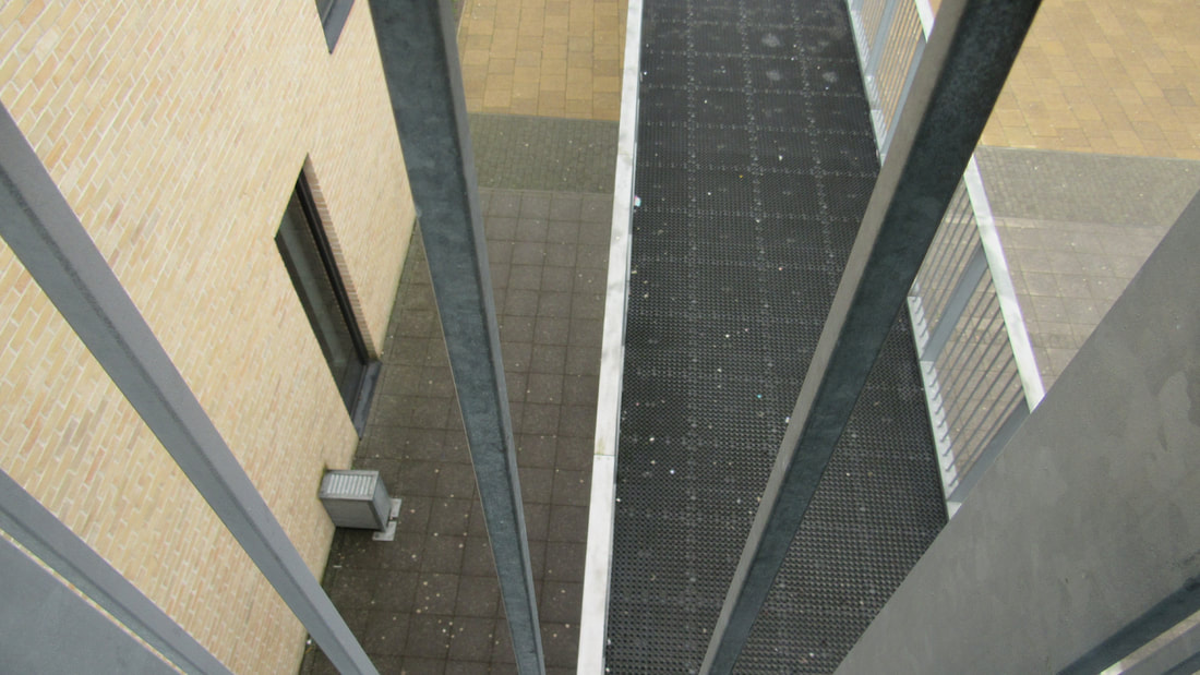
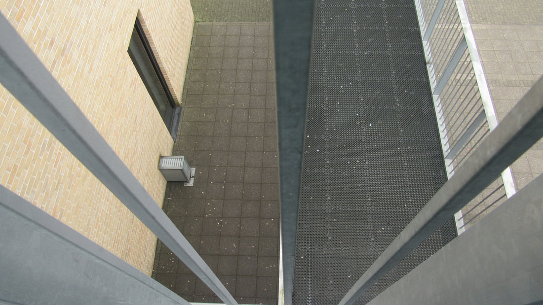
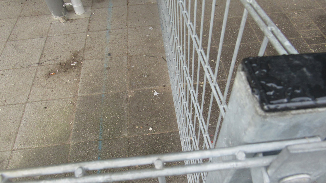
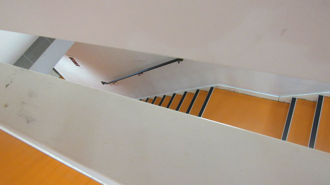
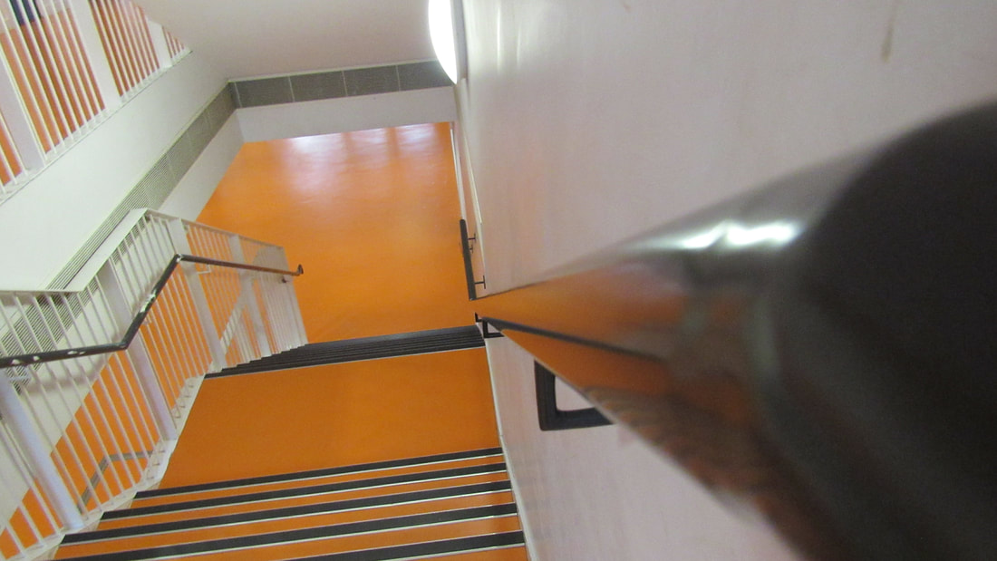
photos in the class room

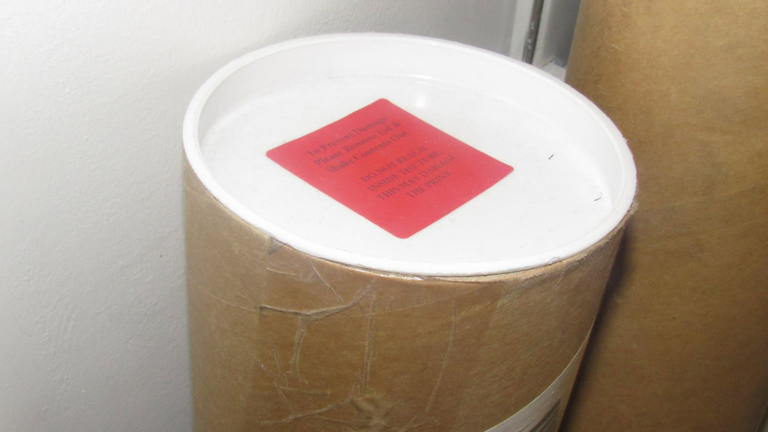


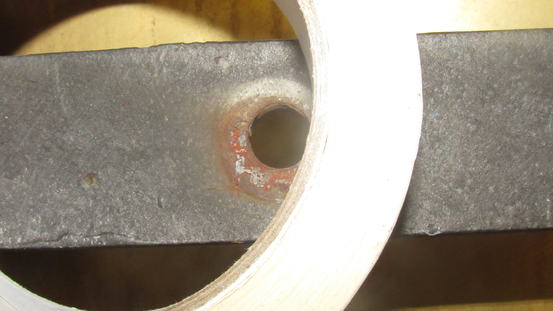
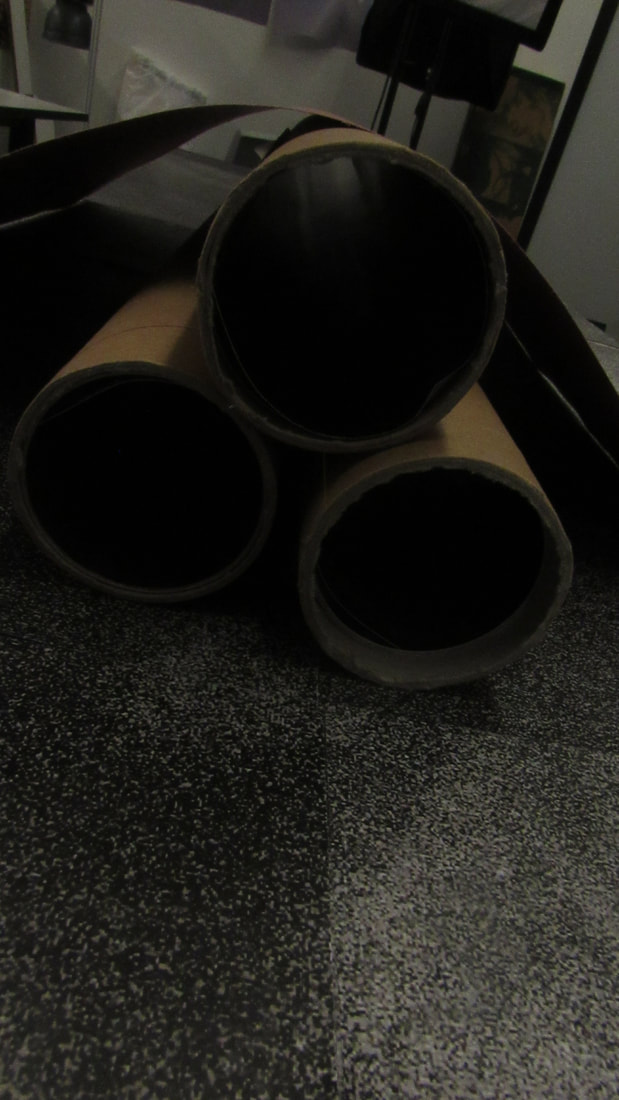
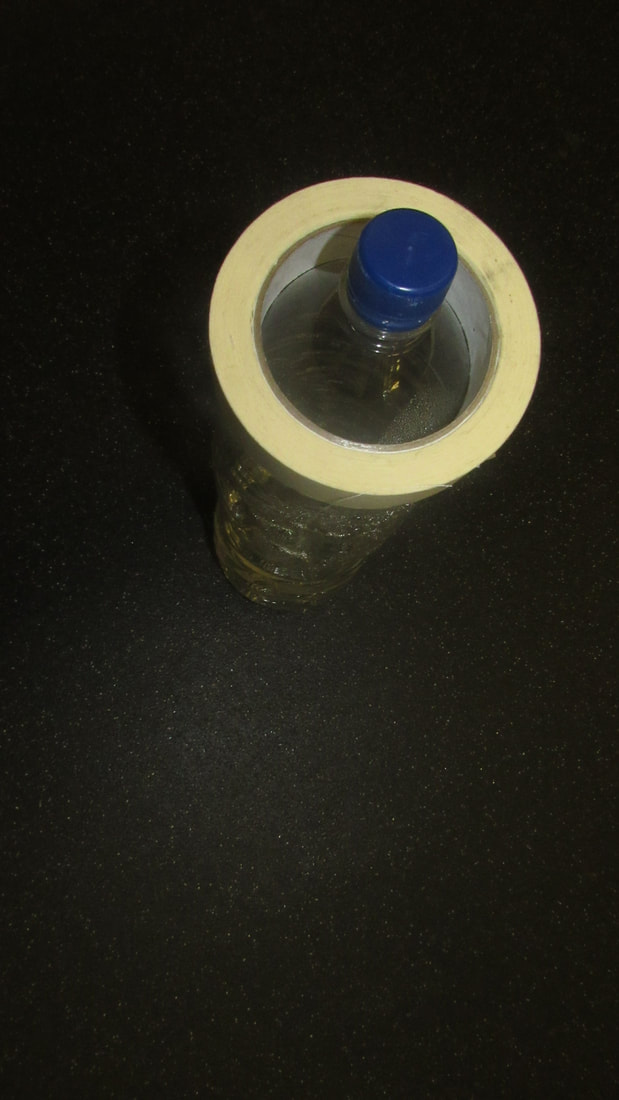
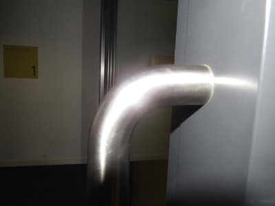
this task was to take photos of edges around our classroom.
WWW:i like all my images and I think I got some good photos of edges
EBI:next time I should focus on the rule of thirds
WWW:i like all my images and I think I got some good photos of edges
EBI:next time I should focus on the rule of thirds
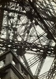
the photogether I pick is Pierre cordier he takes pictures focused on circles thats what we have in common
triptych
what is a triptych in photography?
triptych is photos together in photography.
how do you create a triptych?
images what go together put together.
triptych is photos together in photography.
how do you create a triptych?
images what go together put together.
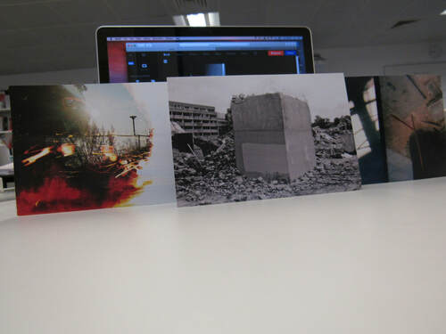

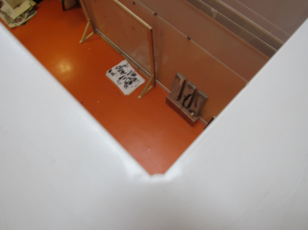
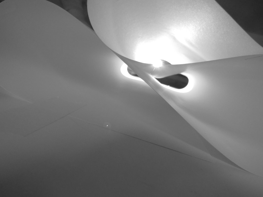
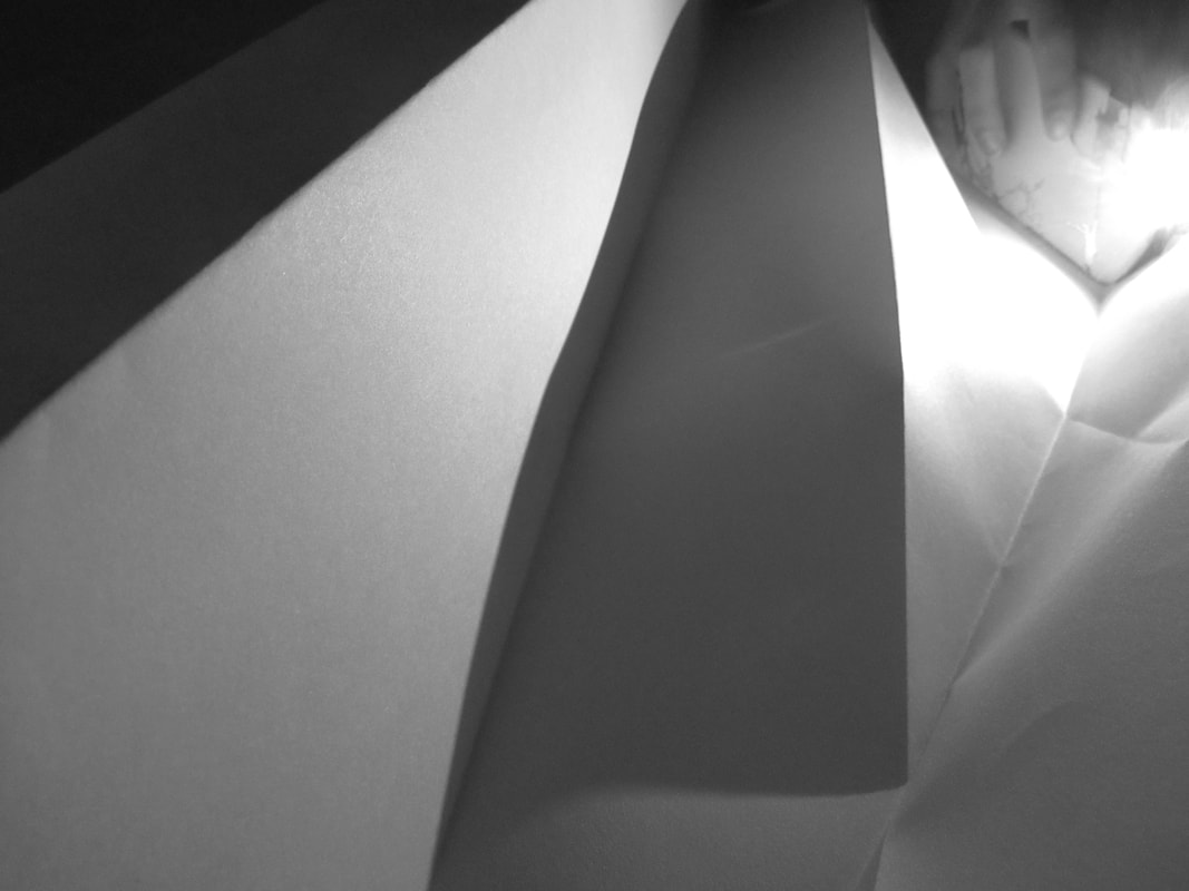
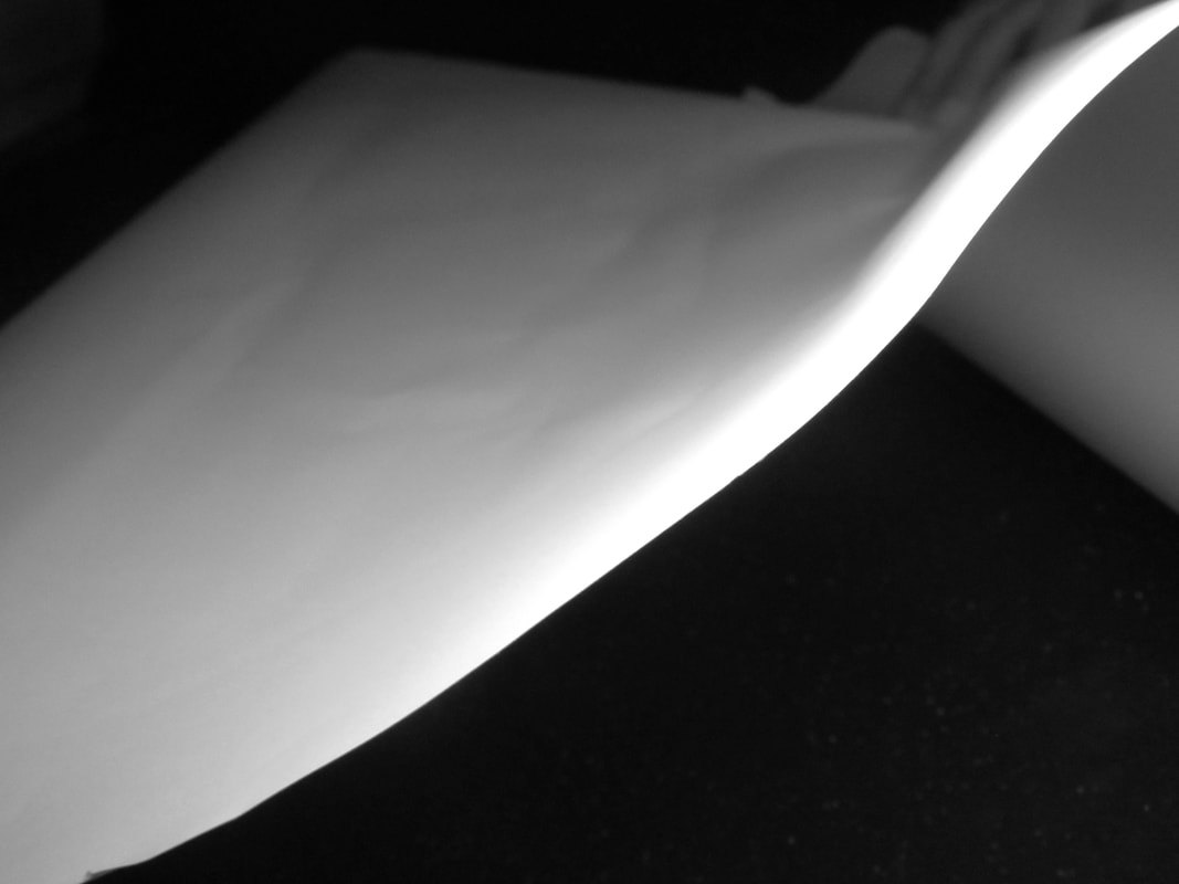
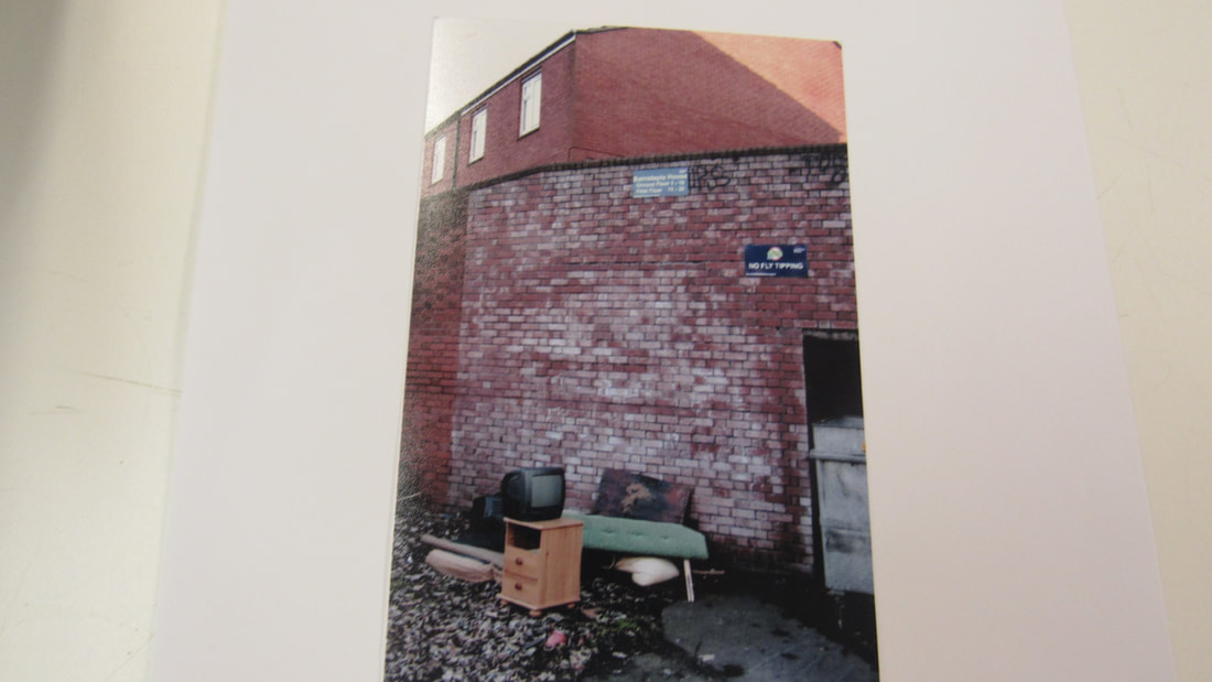
these are my three pictures I chose for my triptych.
I chose these because they all went together in my opinion.
in my triptych I focused on zoomed in and zoomed out.
I chose these because they all went together in my opinion.
in my triptych I focused on zoomed in and zoomed out.
next im going to to do all my photos in black and white.
edges comparison
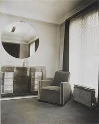
Both of the images are messy and sloppy.
The image by RobertFrank it is dark and split into 2 sections, compared to the image by Lorenzo vitturi which is colourful, bright and is split into 3 sections.
Lorenzo Vitturi's painting looks a bit like a decayed sculpture and the writing looks a bit depressed and as if not that much effort has been put into this painting. He has used a mirror and used a doll compared to Lorenzo vitturi who used fruit and this image reminds me of the beach.
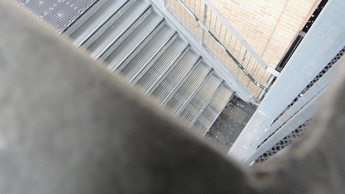
independent project
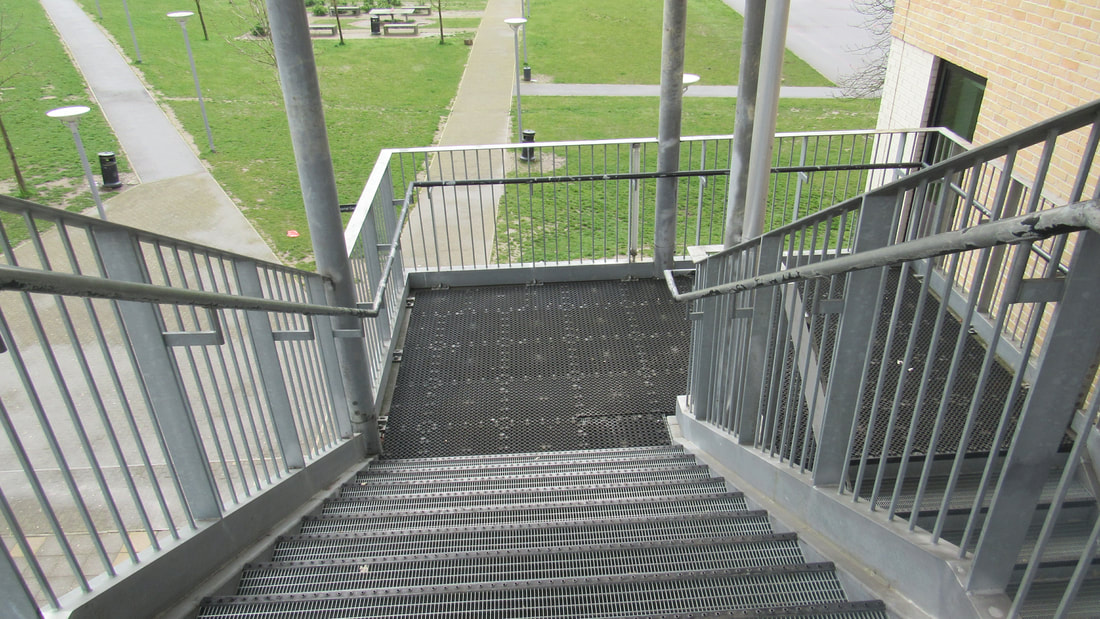
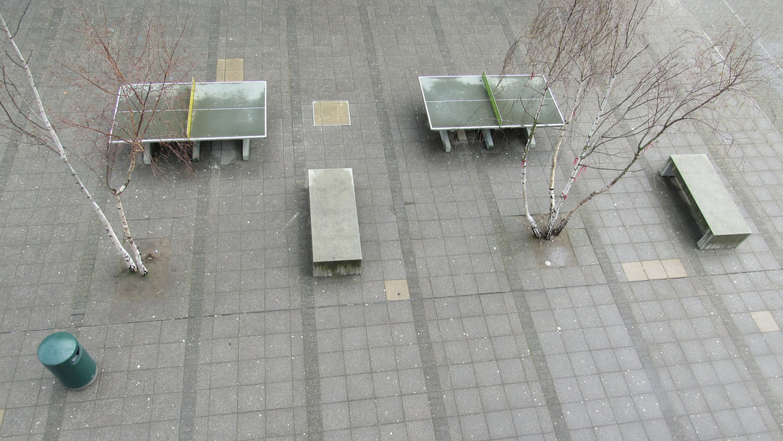
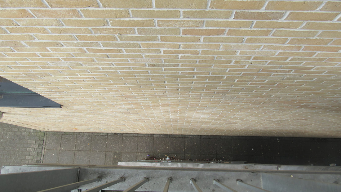
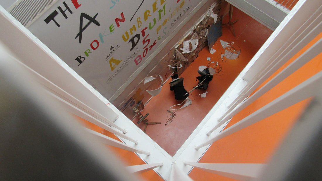
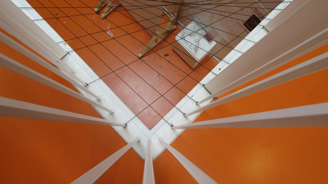

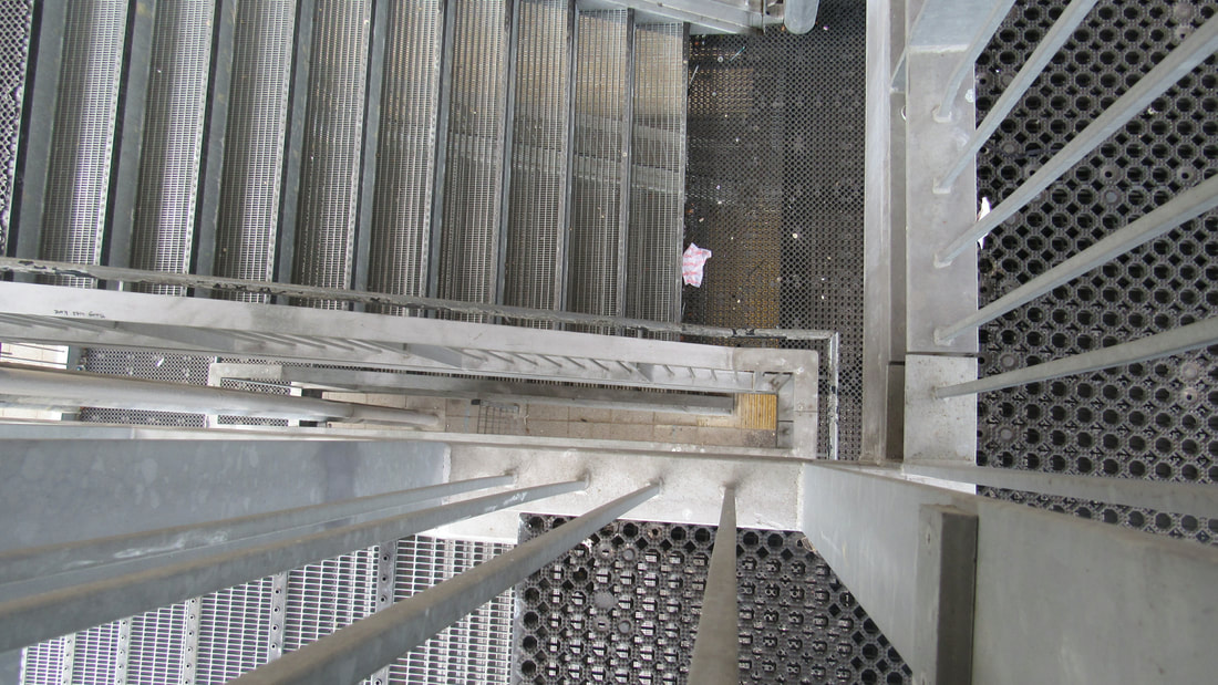
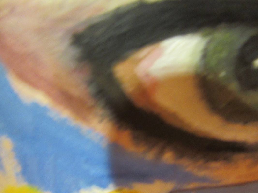
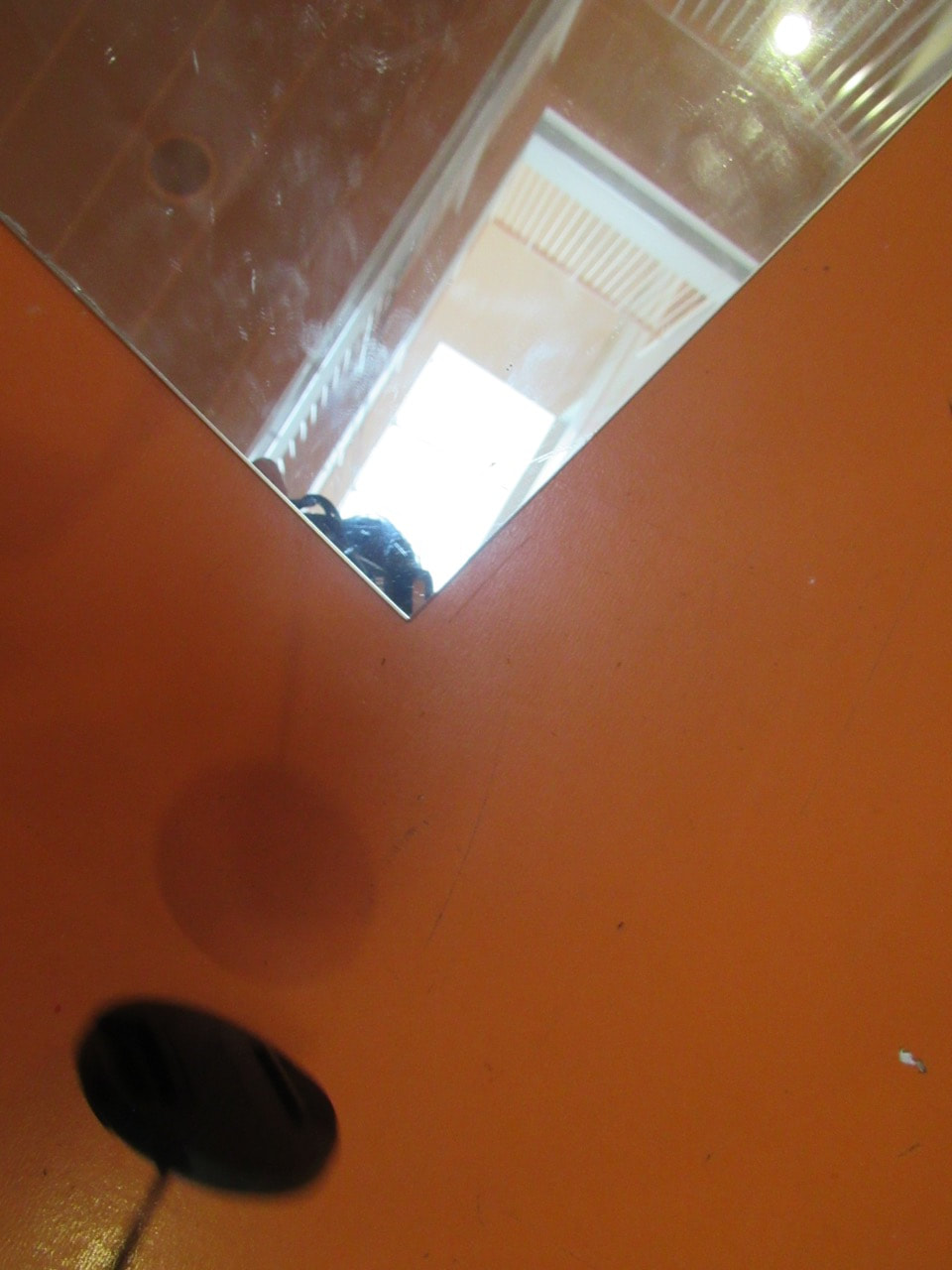
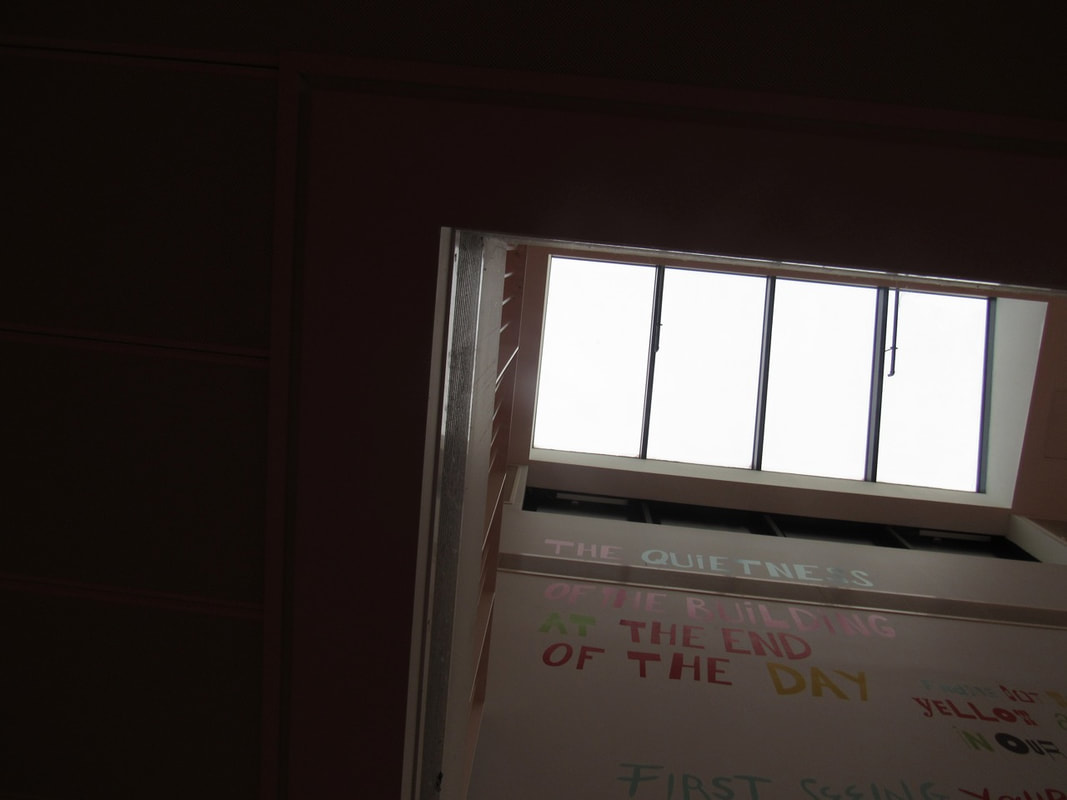
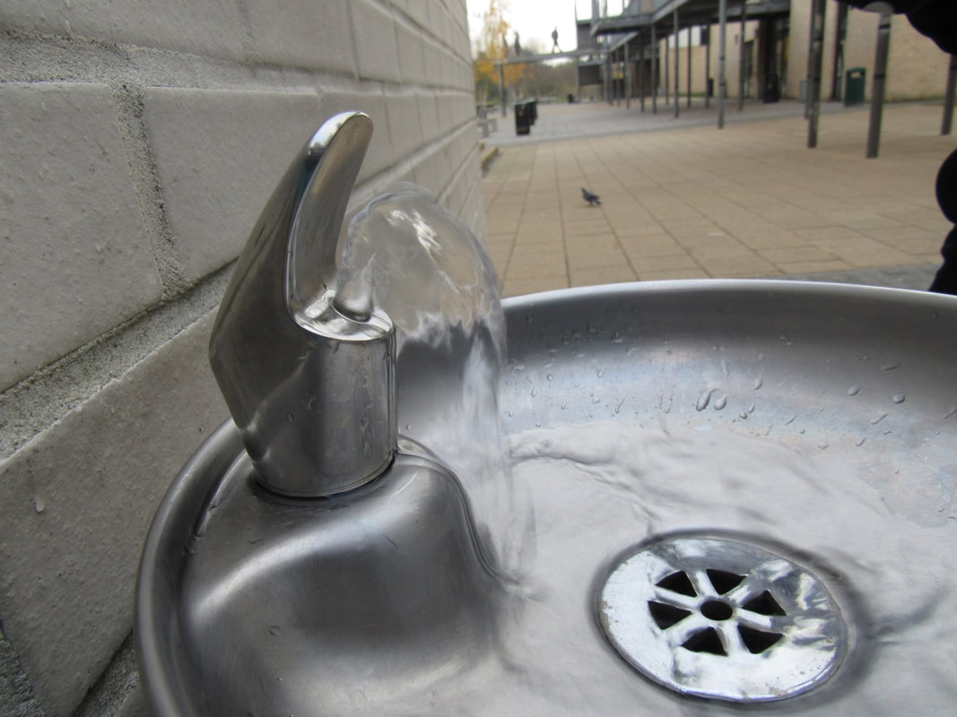
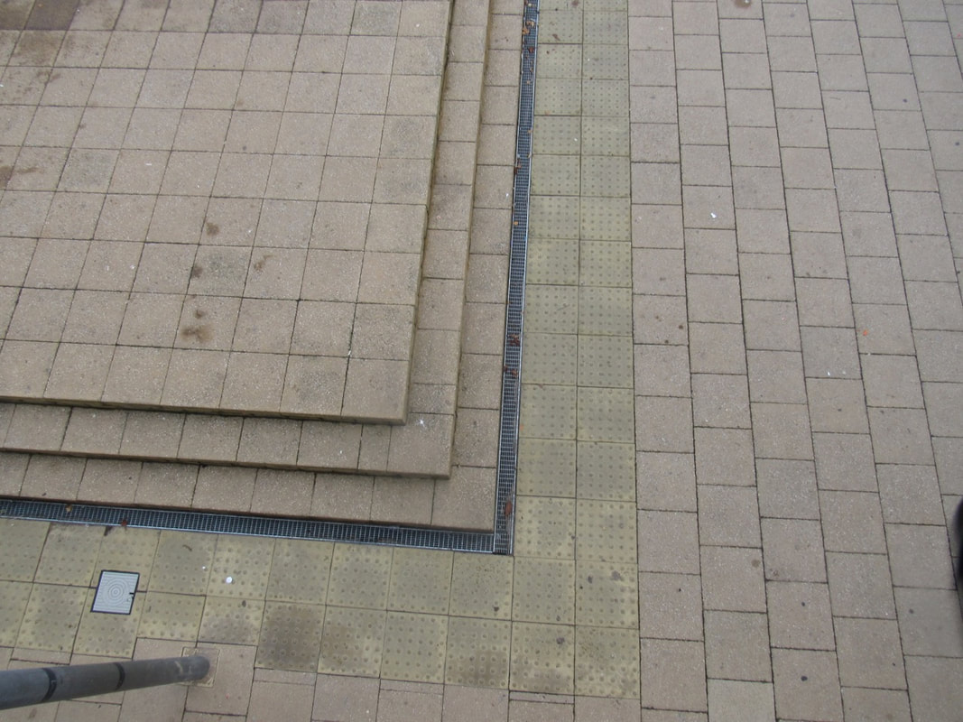
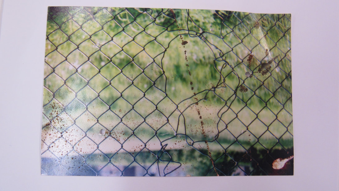
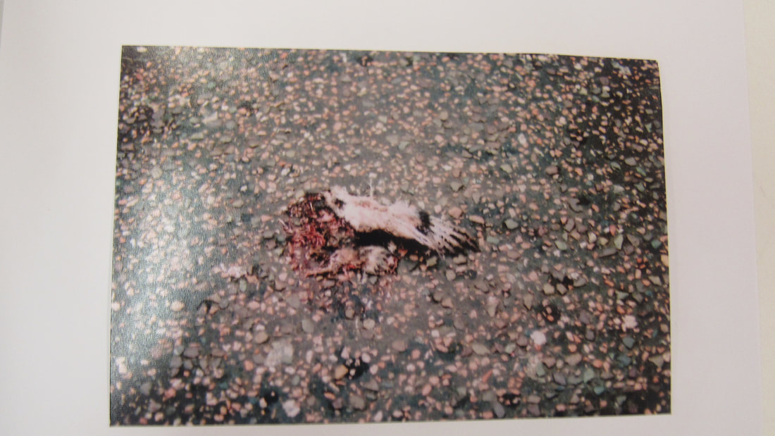
For my independent project I picked looking down, my favourite images I took today was this one.
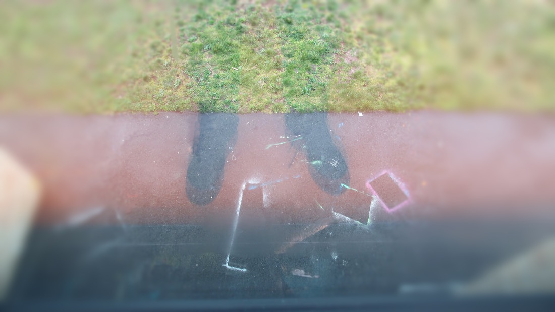
This is my favourite image because its got differnt sections and its unusual.
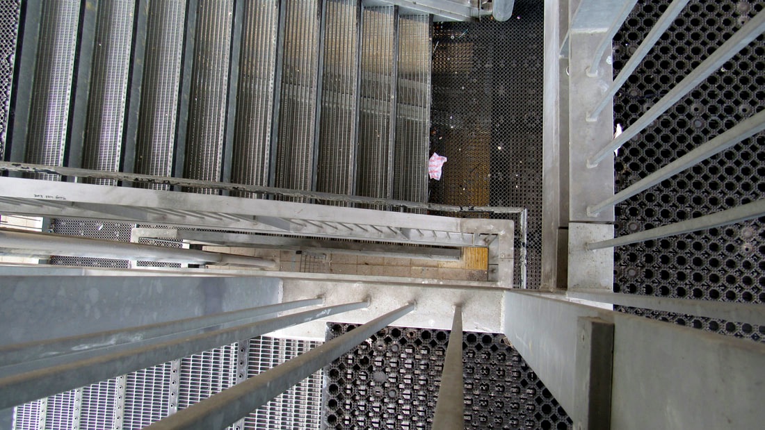
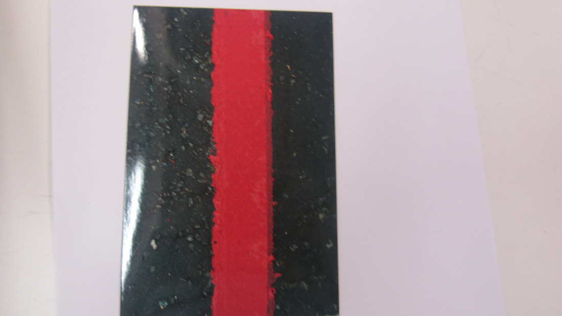
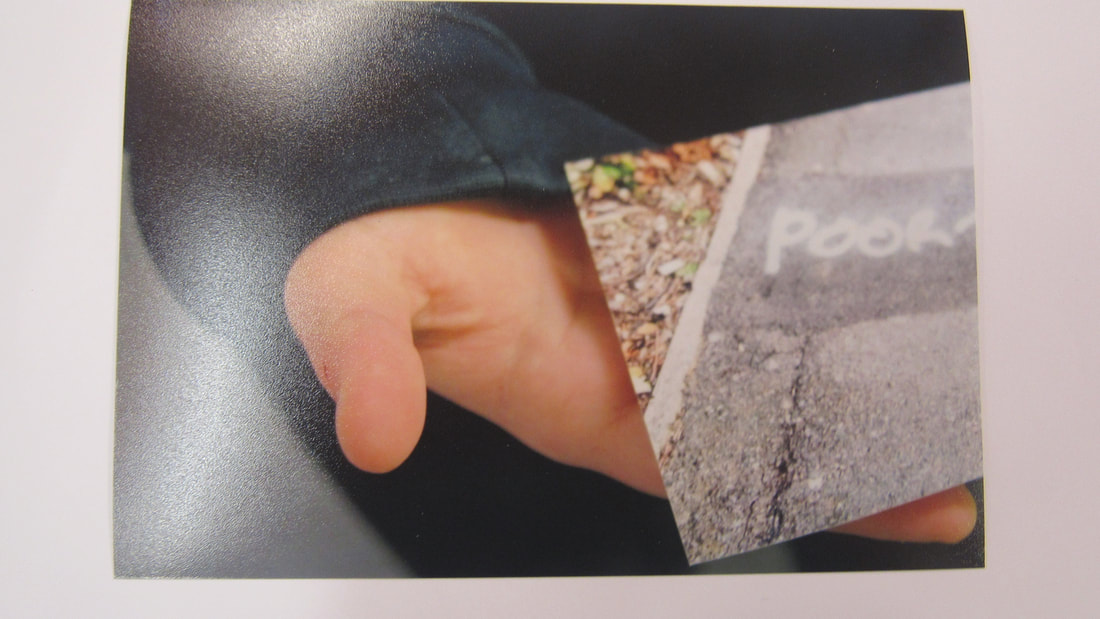
Im going to use these two pictures for my independent project I like these photos because there unusal and they go together.
